
Collaboration
Where mercado started
Mercado started as a collaborative group effort where our team did concepting, site-mapping, and wire framing.
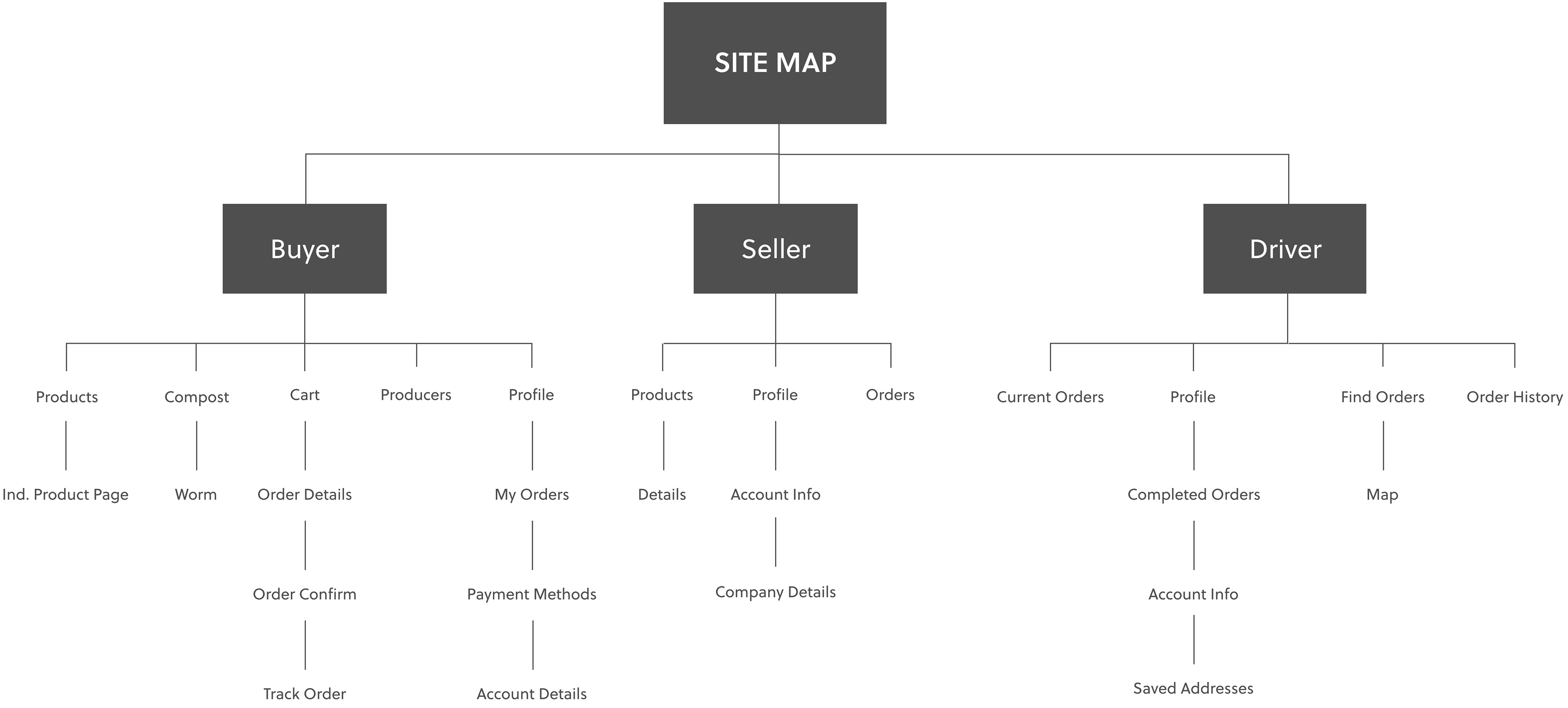
Initial site-map
Screen-flow wireframes
Moving Forward
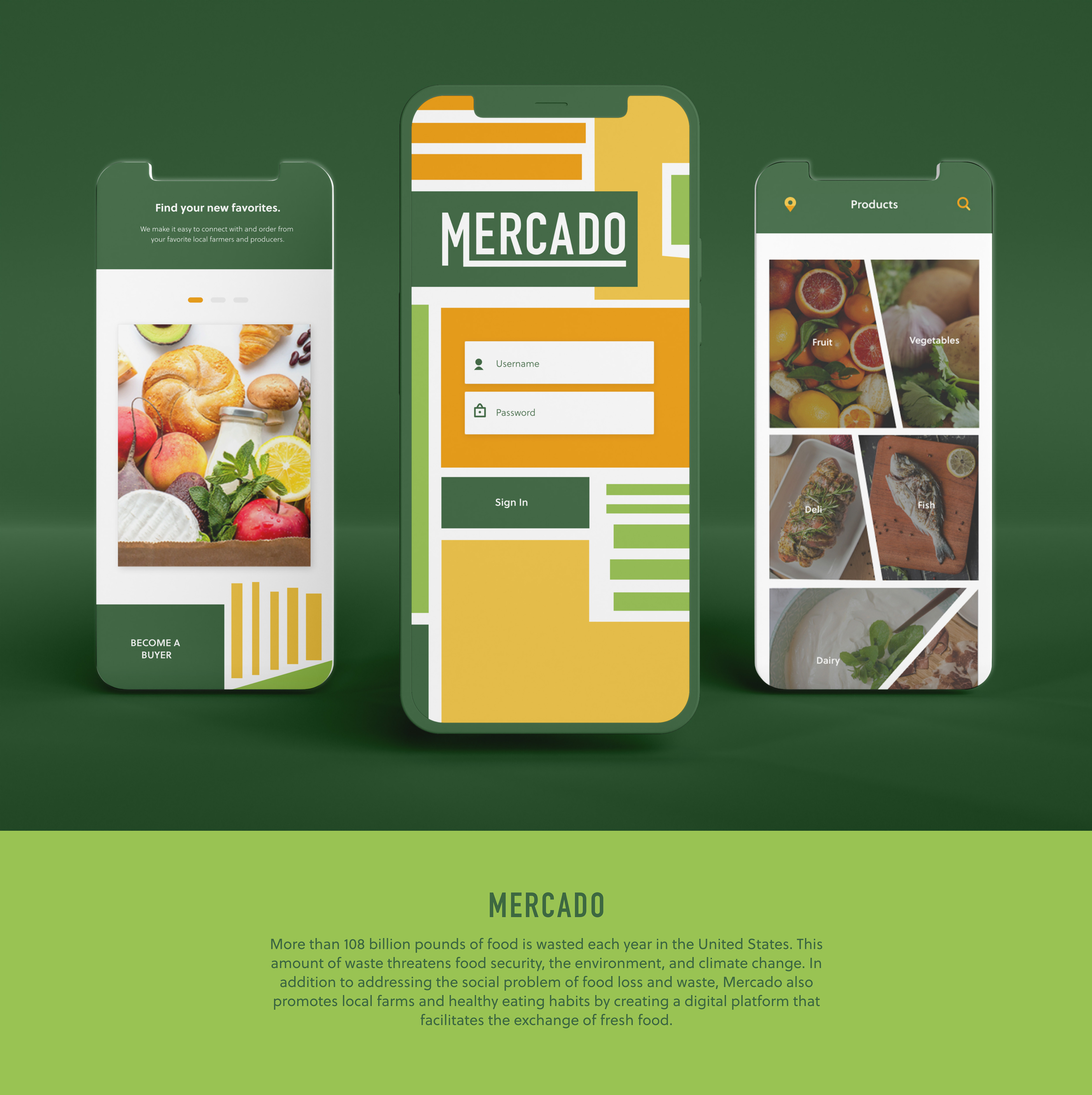
Mercado Rebrand
After concepting the Mercado idea in a group setting, I moved on to develop the brand image and screen prototypes individually.
Developing the Brand
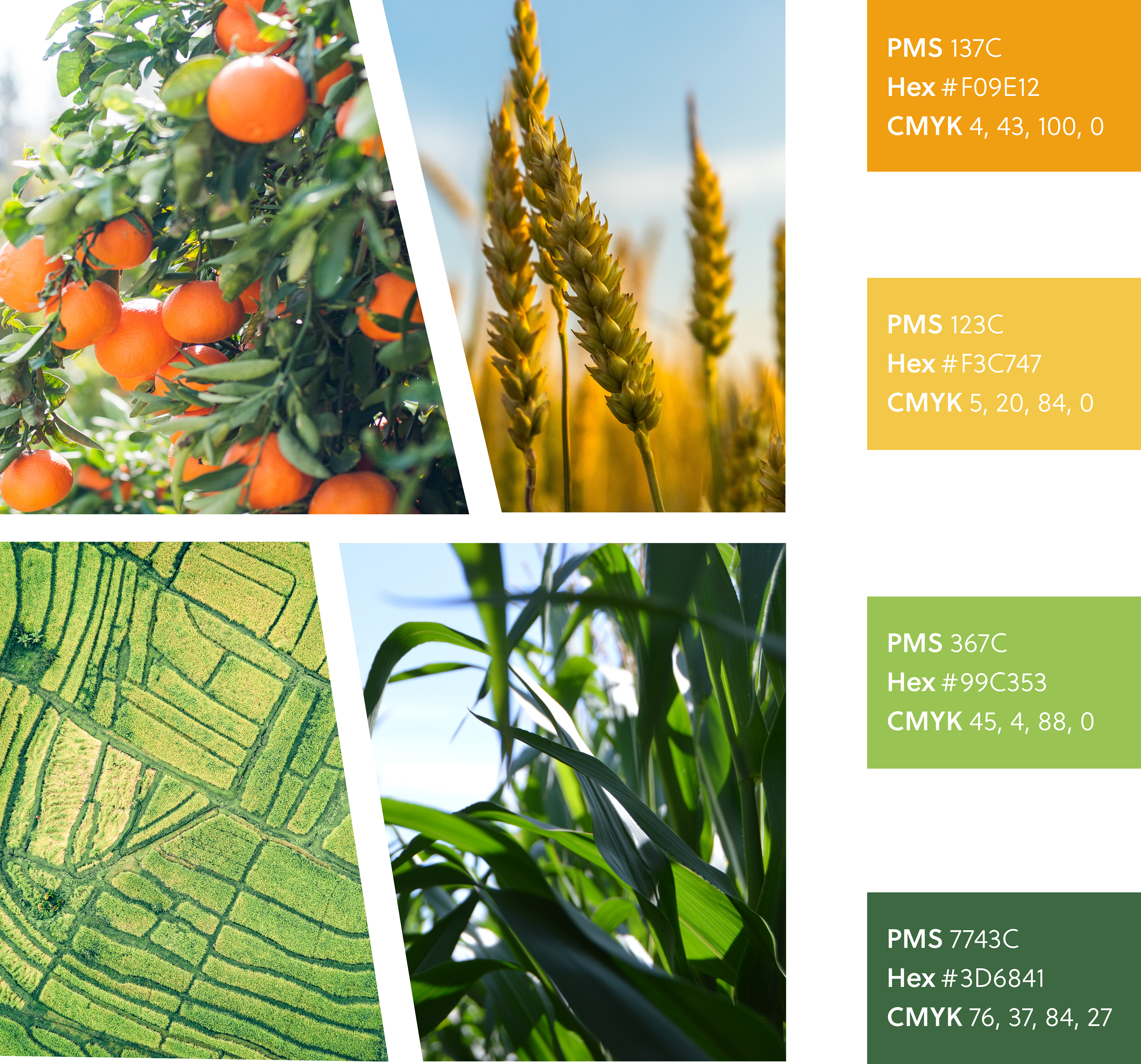
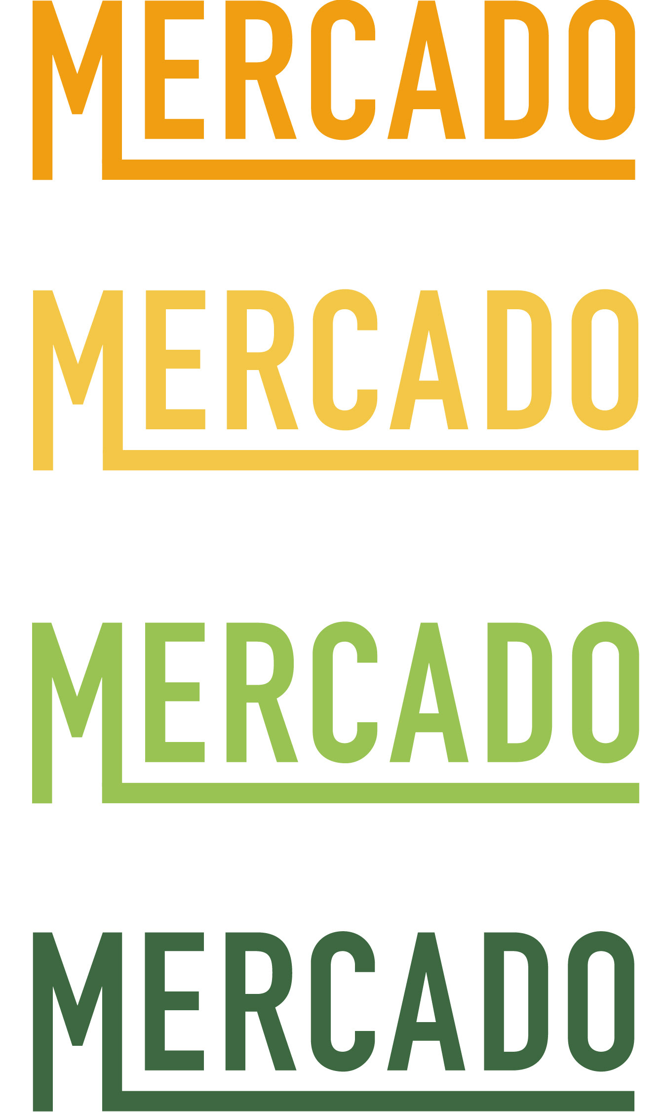
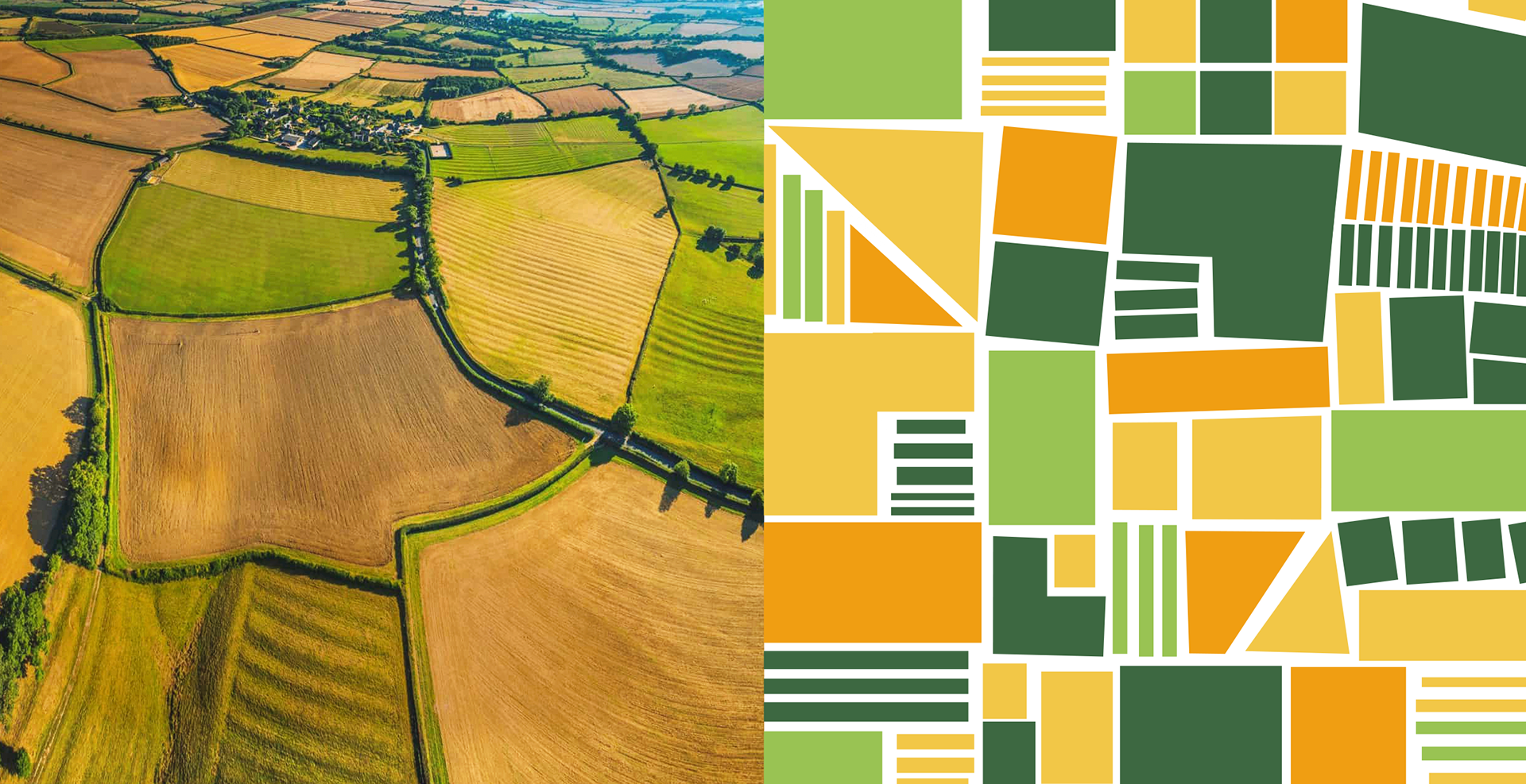
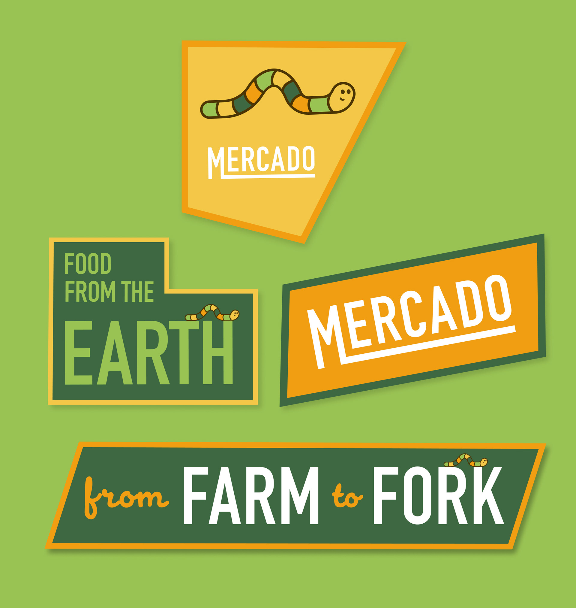
Logo, Colors, & Typography
Mercado's branding was inspired by farm fresh produce and the aerial view of farmland that creates polygonal shapes. The logotype is designed to emanate a feeling of "friendliness" and "freshness."
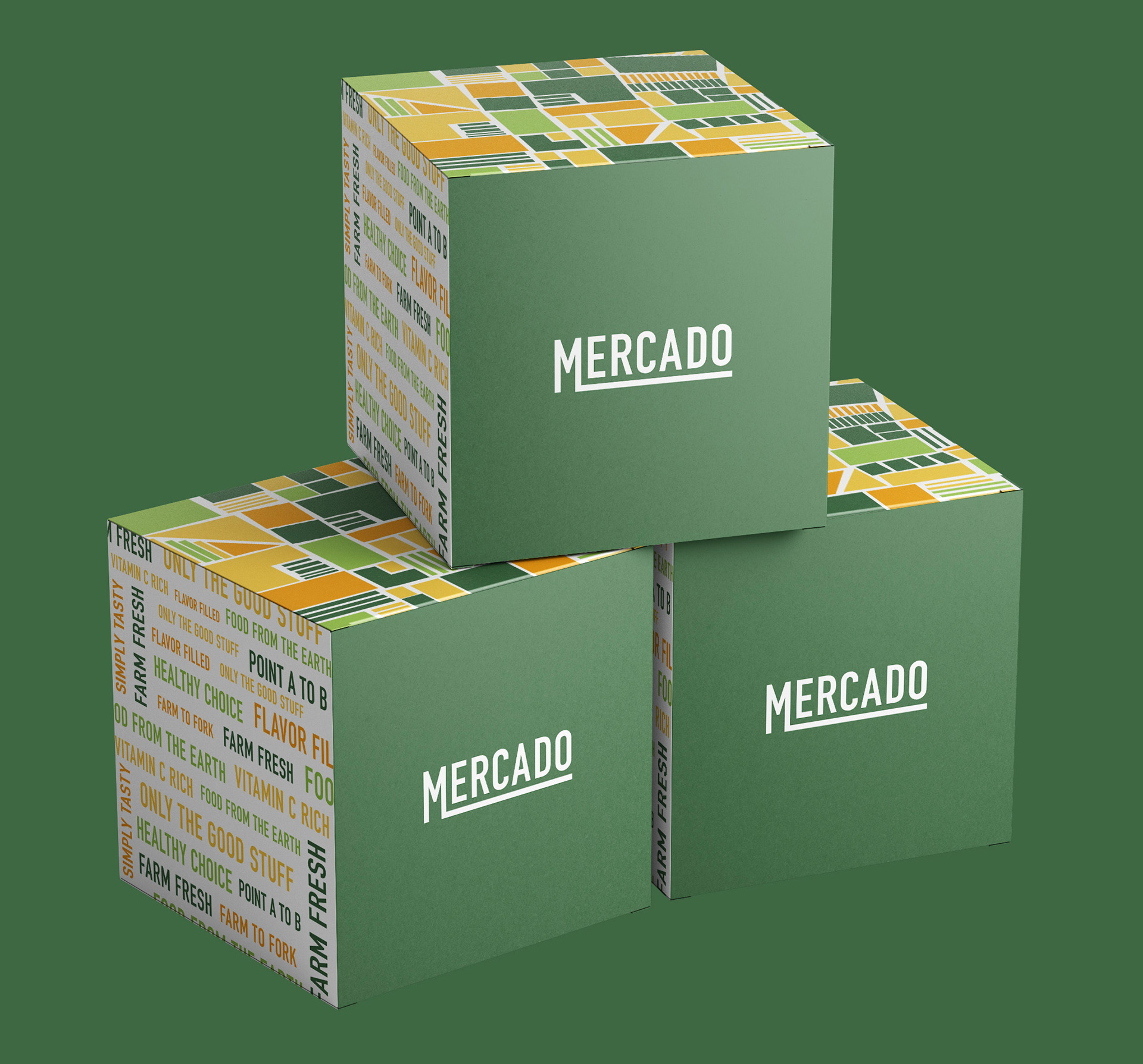
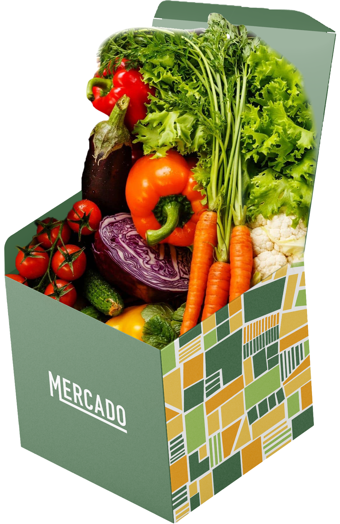
Branded shipping boxes that can be reused for composting at the end of each week
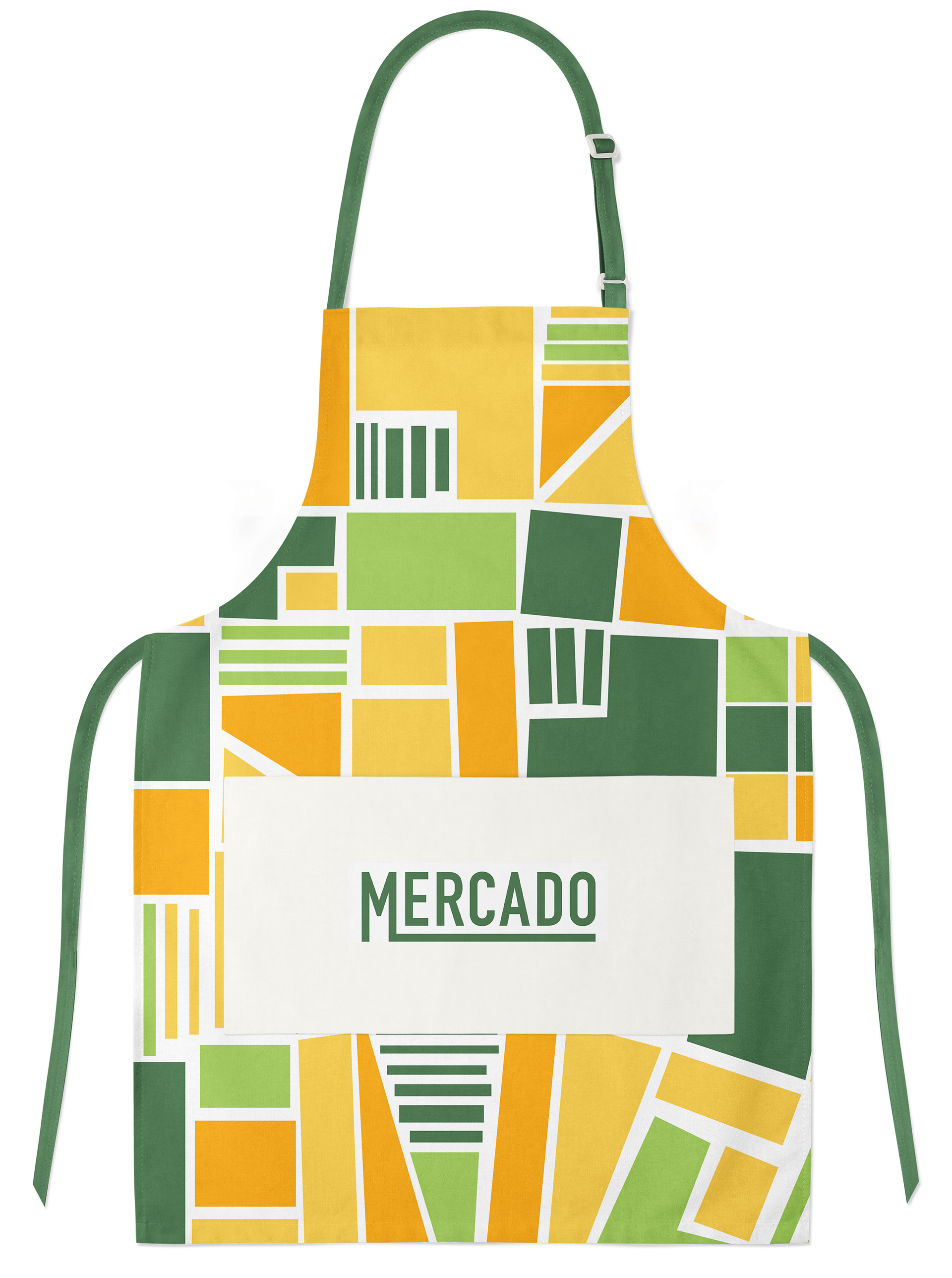
Cooking Apron Gift
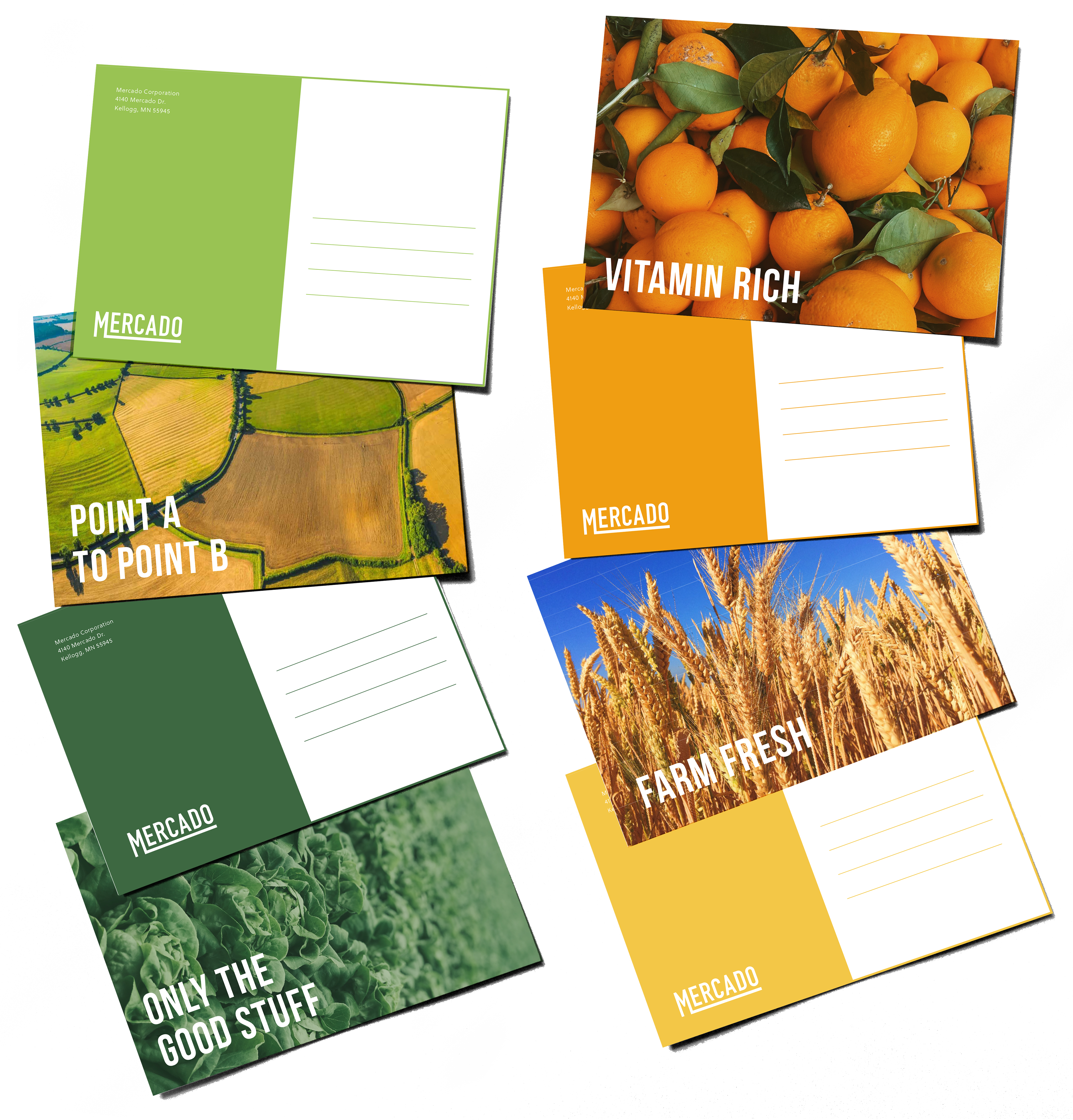
Customers get a free sticker in each box
Household Waste
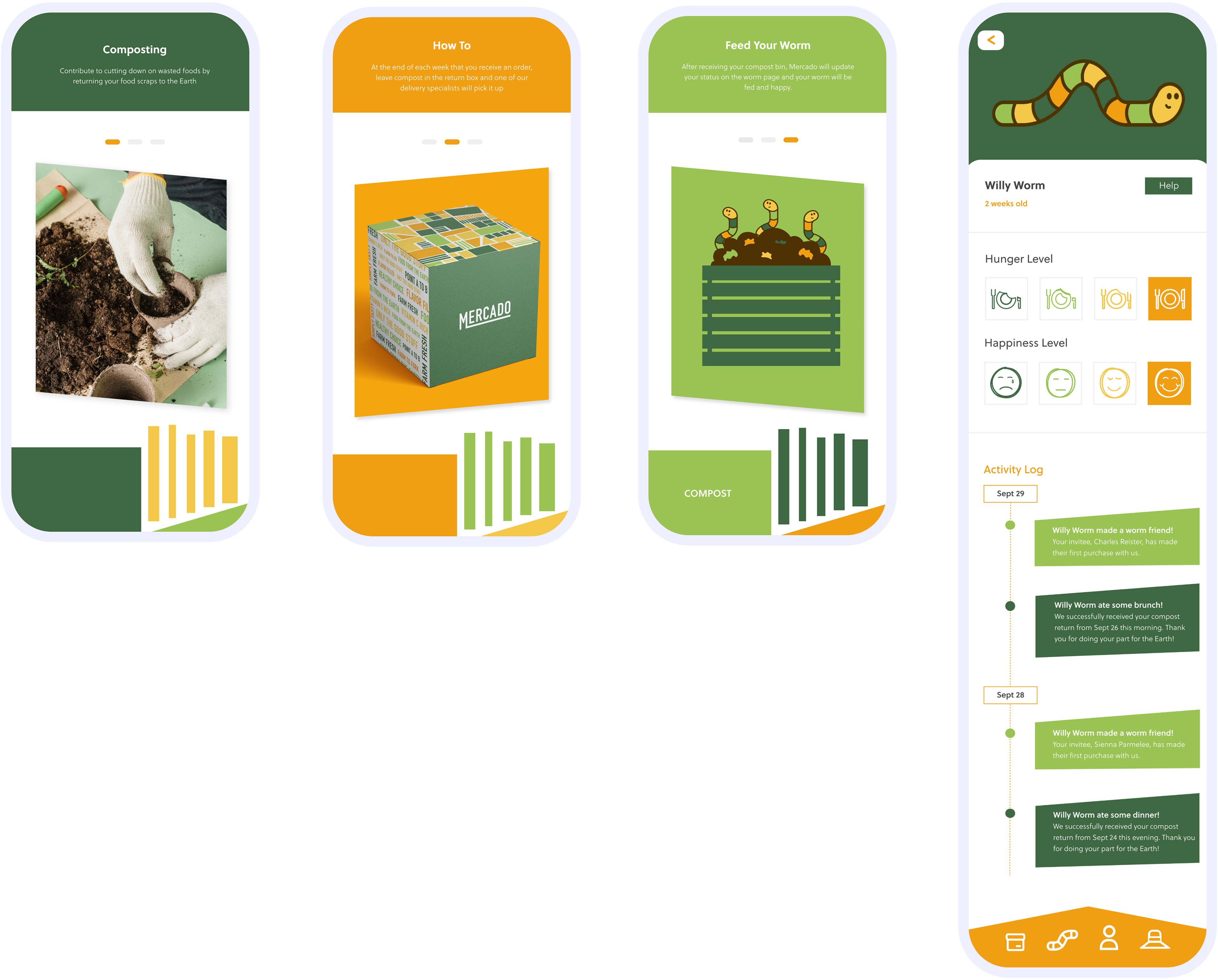
Household food waste accounts for 43% of all food waste in the United States, and Mercado is taking steps to cut down on this waste through the use of convenient composting techniques.
Convenient Composting
After receiving an order from Mercado, our users can take all of their food waste from that week, and leave it in their delivery package for one of our drivers to pick it up and bring it to our composting unit.
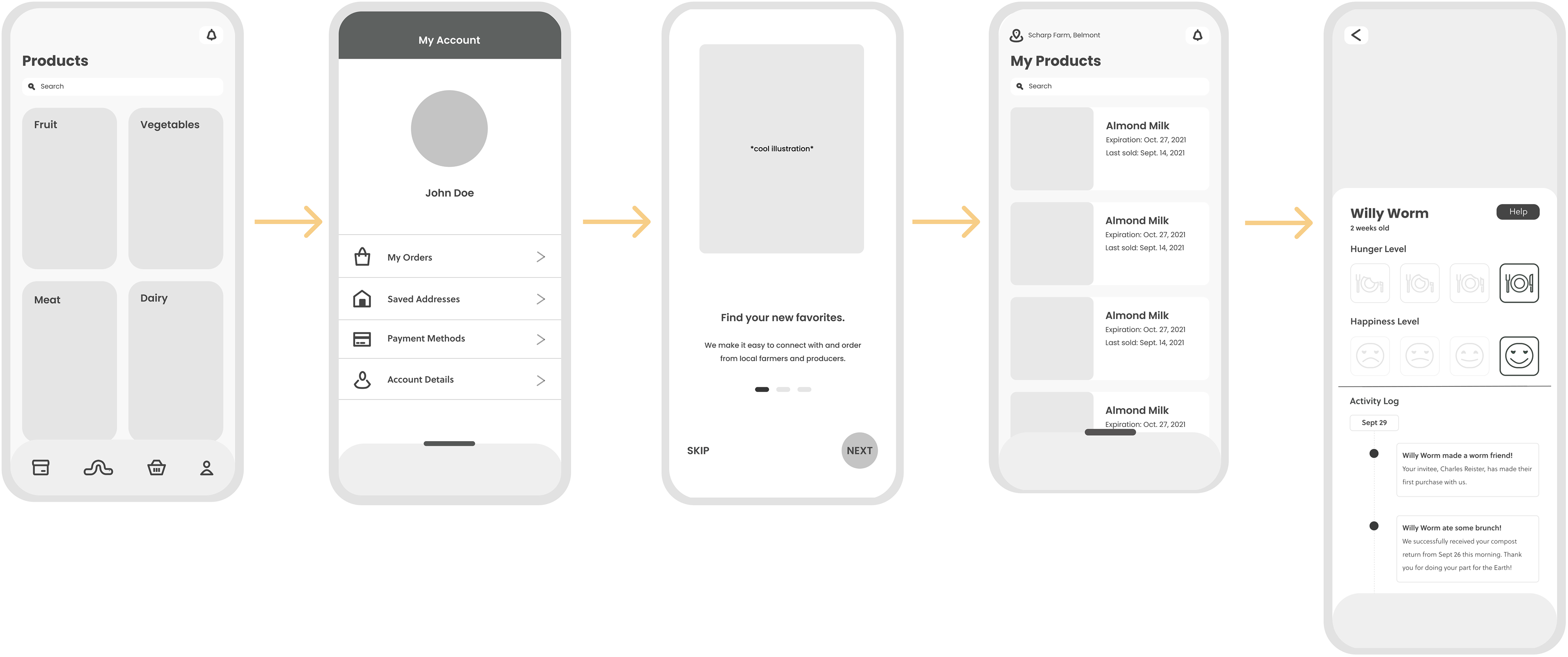
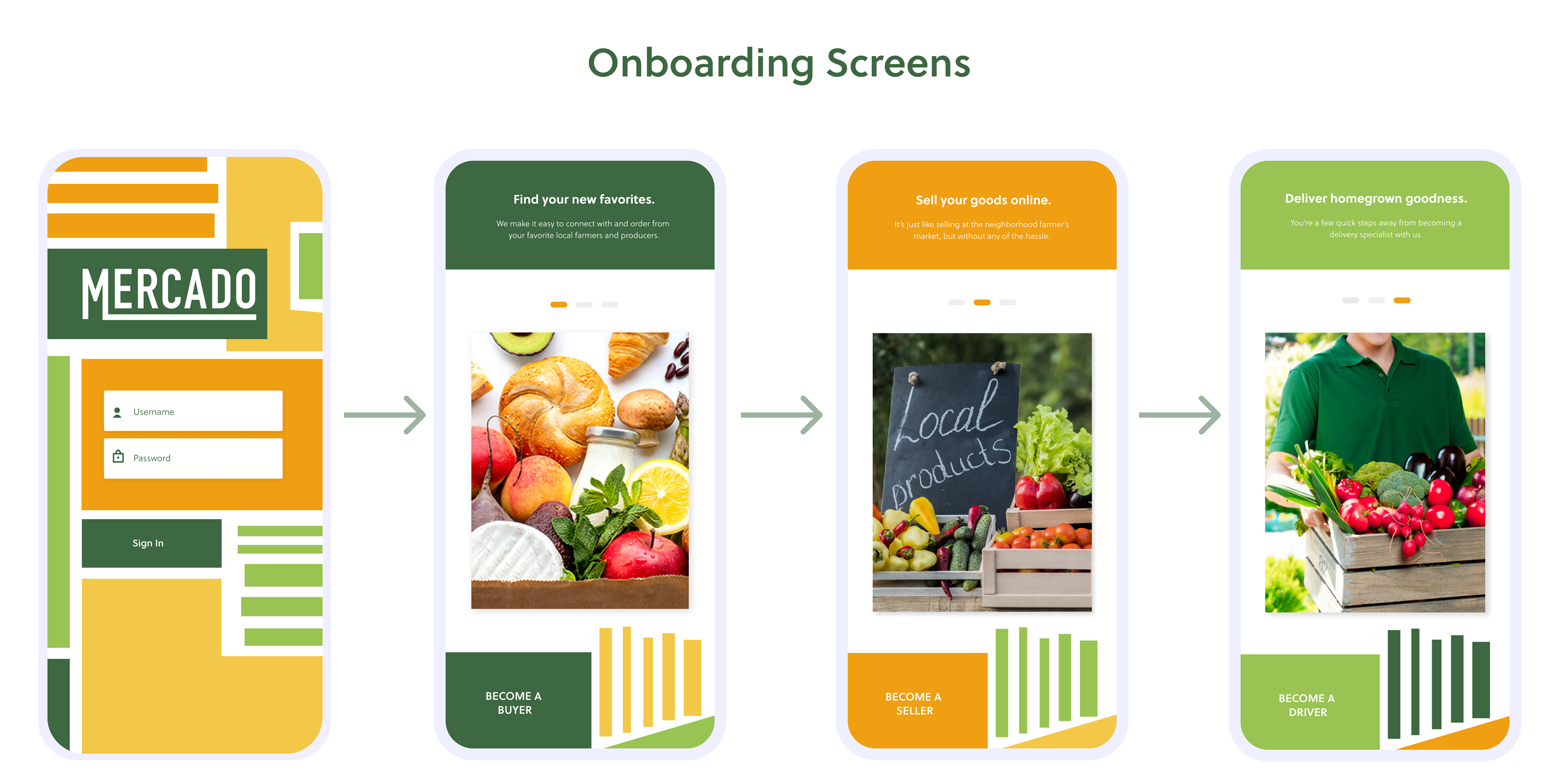
The App
Incentive Program
Mercado also has an incentive program where our users can adopt a worm from our unit, and in order to keep it alive and happy, they have to send their waste off to compost each week.
Prototypes
I designed the app based on my rebrand with graphics and colors that were fresh, friendly, and farm-like. This created user-friendly screen flows with a unique feeling that the original wireframes didn't have.
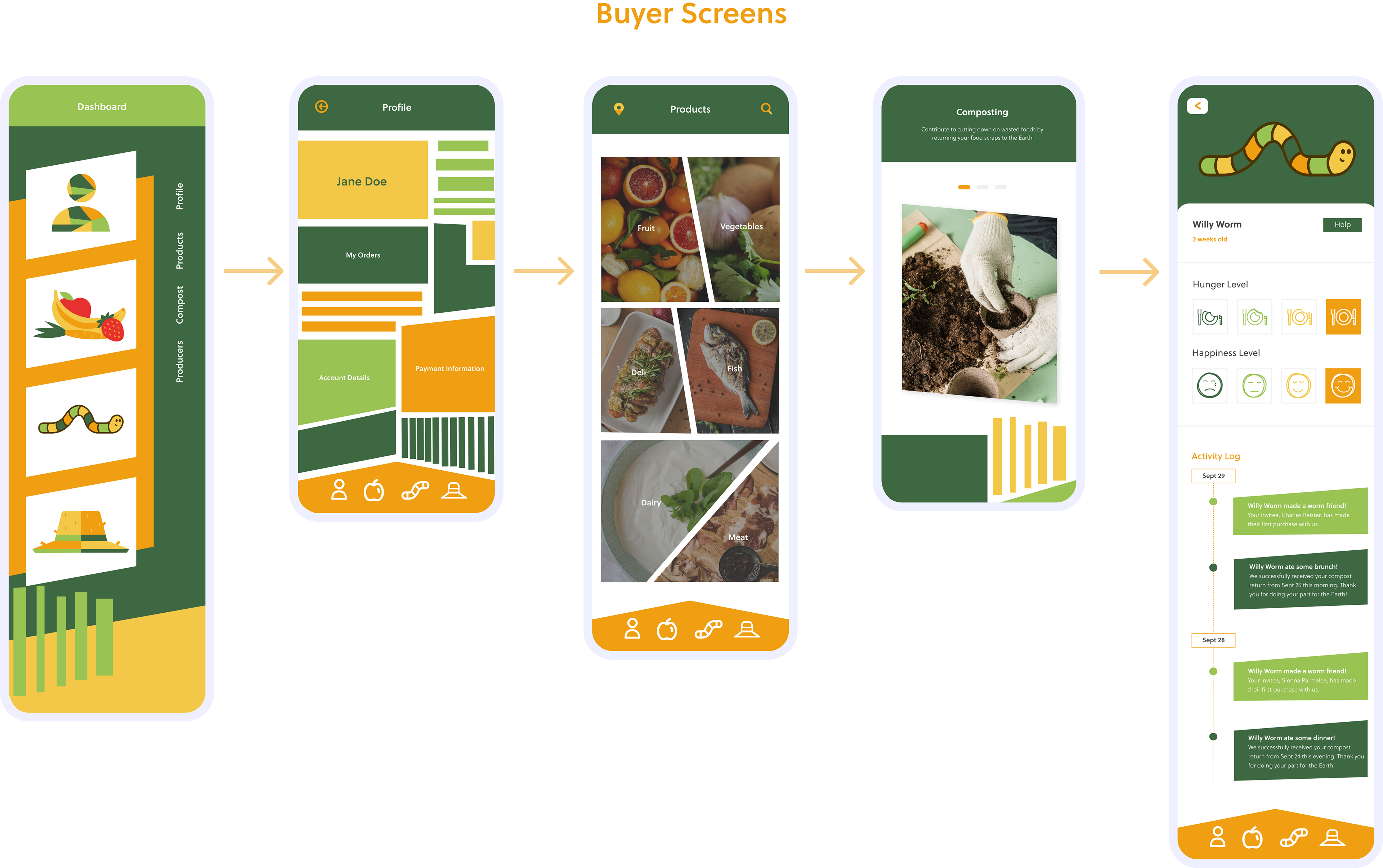
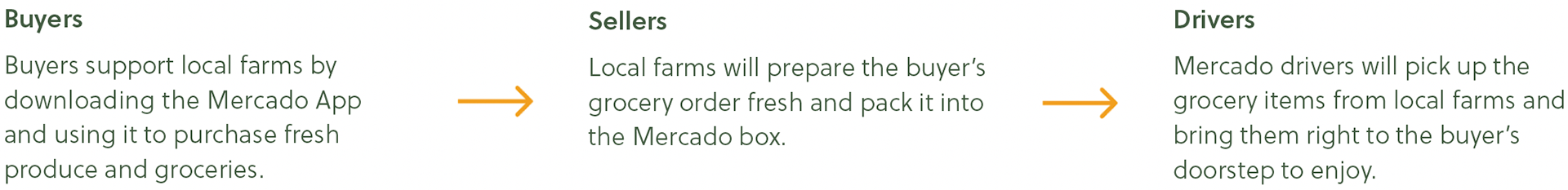
Buyers
Mercado supports local freshness by making it easy for buyers to find farmers and producers in their area to purchase goods from. One of Mercado’s main goals includes eliminitating the food waste that occurs in the many stages of normal food distribution by cutting down the number of steps it takes to get from the farm to our customer’s doorsteps.
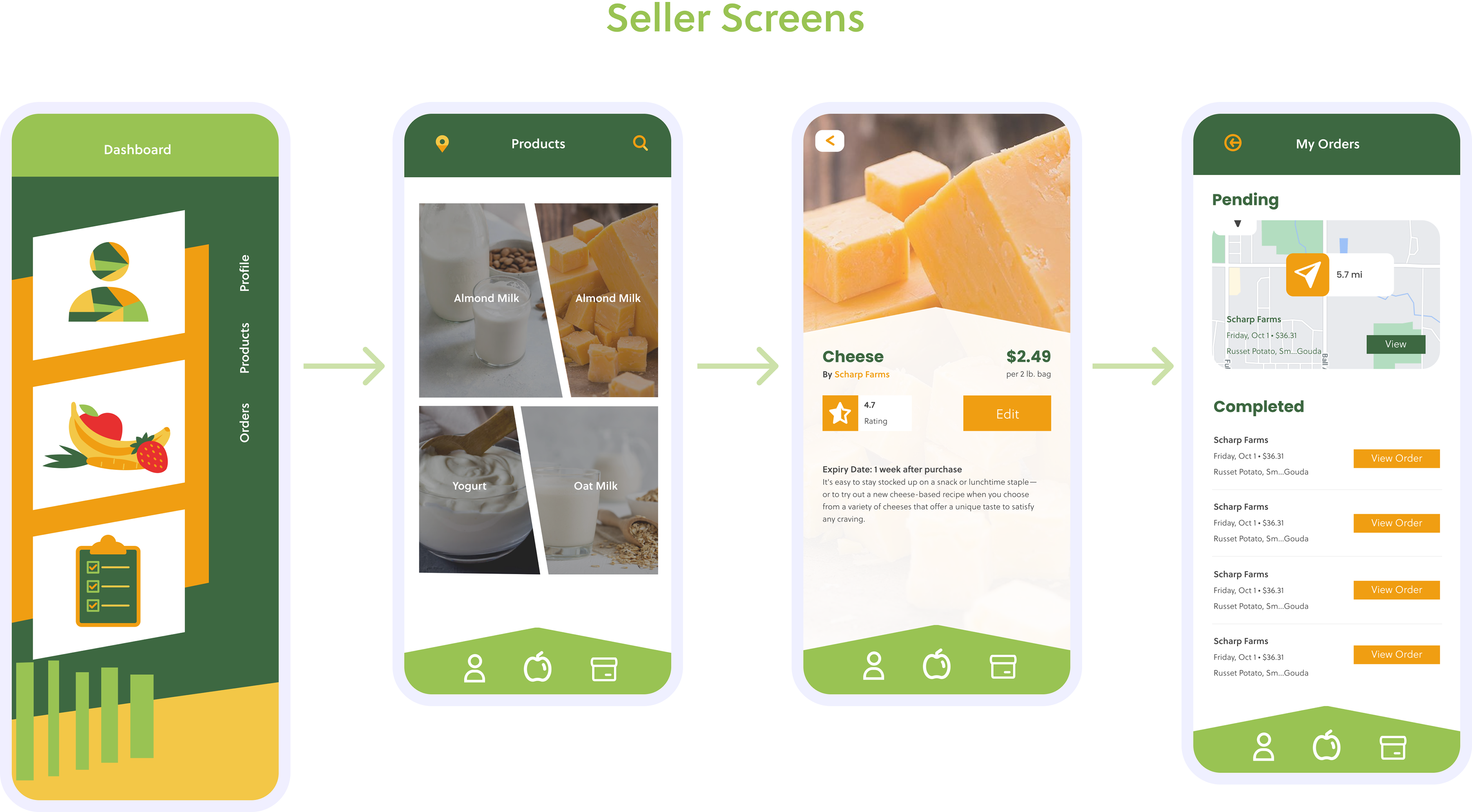
Sellers
Mercado makes it easy for local farmers and producers to find new business and contribute to the cause of waste reduction. Mercado offers features specifically for producers such as personal product inventory, ratings, and order specifics.
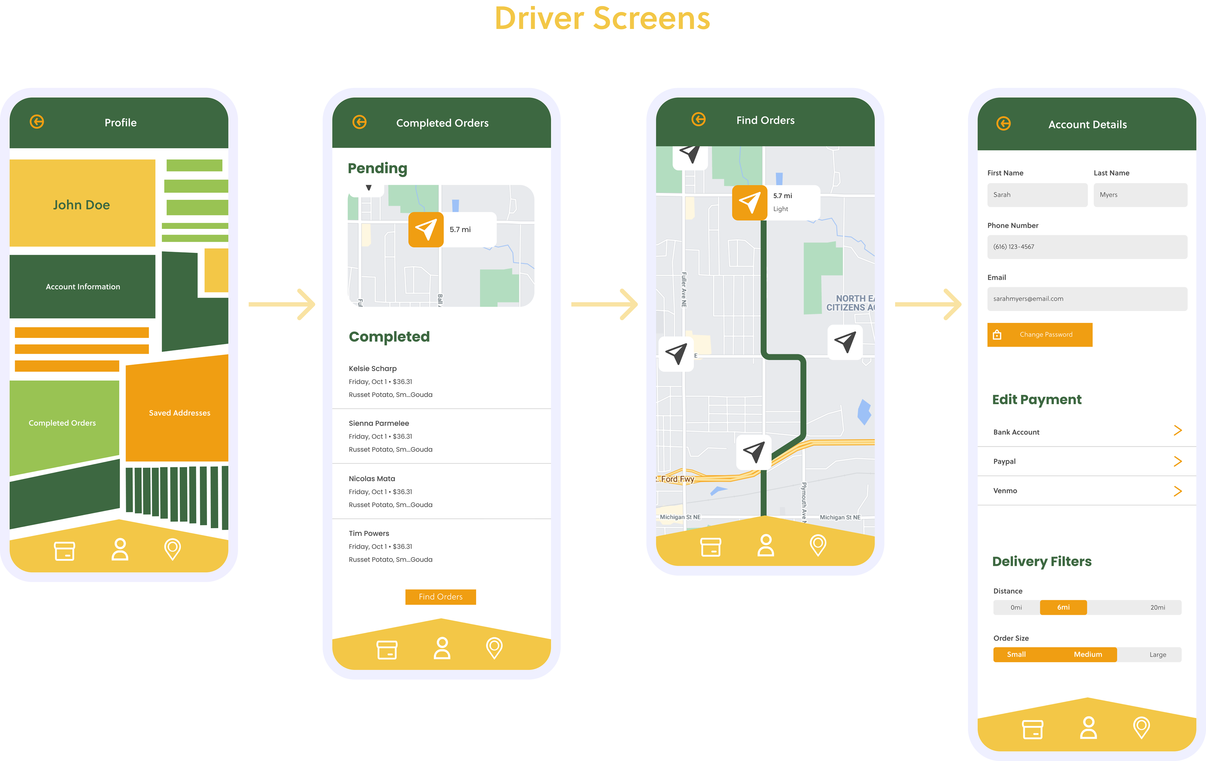
Drivers
Mercao allows for drivers to pick up orders on their own schedules for extra cash. Drivers are able to find orders near them, receive payment right from the app, and view their completed and in-progress orders.